
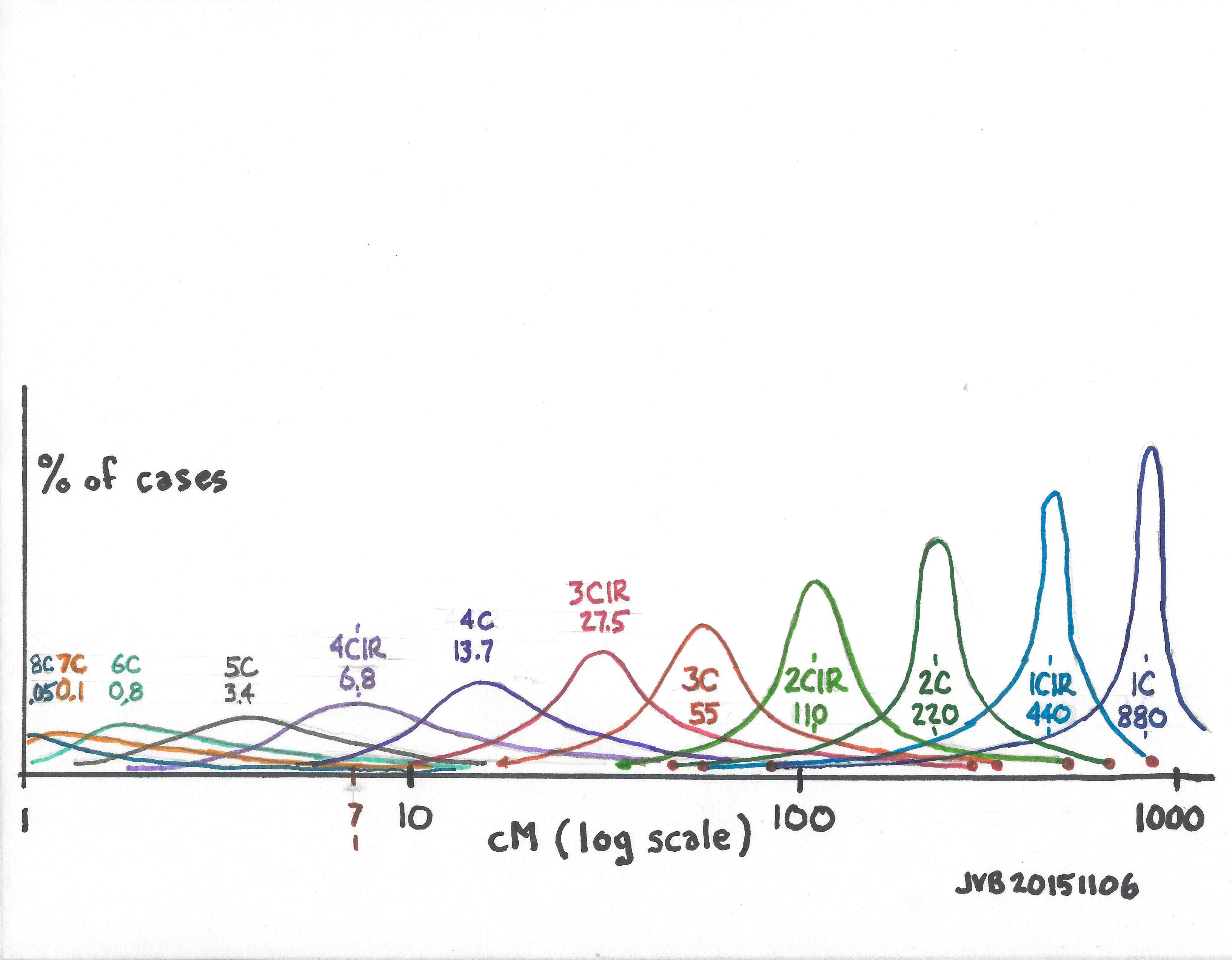
We need a one-page chart that shows the empirical cM values found for various relationships. We know the theoretical, or calculated values, but the randomness of DNA results in a fairly wide range in some cases – particularly for distant cousins.
The chart below shows my guess as to what a chart might look like. The x-axis is cMs on a logarithmic scale. The y-axis is % of all the values for each cousinship (the number of results at each cM value divided by the total number of results for that cousinship – which would normalize the chart for different total number of results for each cousinship). The area under each curve would be 100% of all results. The roughly normal distribution curves are “centered” on the calculated cM values for each cousinship. Based on experience we know that first cousins (1C) tend to share segments with cM values relatively close to the calculated value of 880cMs, producing a tall thin curve (I think); whereas 5C (calculated average 3.4cM) or 6C (calculated average 0.8cM) must have long cM “tails” on this chart in order for us to “see” the shared segment with Matches which are above a 7cM threshold, producing a short wide curve (I think).
Note in this hypothetical chart, the small red dots at the end of some tails were taken from the data compiled by Blaine Bettinger (who did a great service to us all by compiling and reporting this data), which can be found at:
We need this data displayed this way so we can easily enter with a shared cM value on the x-axis and see the range of cousinships possible. This would quickly show which cousinship is most probable, and how close, or far, other cousinships would be.
As I now think about it, at any cM value on the x-axis, wouldn’t the sum of the values of all the curves have to equal 100%? But to achieve that, we’d have to include all the possible curves, including siblings, half siblings, half double second cousins twice removed, etc., which is probably impractical at this point. I’d rather see the chart soon with the cousinships shown below, than wait a long time for the perfect chart.
Another thought is to blow up the part of the chart from, say, 5cM to 50cM. This would be fairly simple once the data is collected.
Still another observation is that if this chart were based on all collected data, data based on endogamous shared segments would generally be shifted a little more to the right; and data based on non-endogamous shared segments would generally be shifted a little more to the left.
BE CAREFUL – THE CHART BELOW IS A THEORETICAL GUESS (with only a few valid data points)
06B Segment-ology: Segment Size vs Cousinship Chart Needed; Jim Bartlett 20151106

Pingback: Endogamy I | segment-ology
Jim,
23andme’s price went up to $199 US a little while ago, they are no longer all $99 each
LikeLike
Jim,
I have made the same comment on 23andMe and other message boards over the past few months. Beside the link Anne already pointed out on Ancestry, there are a few other charts that hint at the answer. But all are as vague as your hand drawn “sample” or wished-desire or the Ancestry Figure 5.2. I pulled together my links, that I keep up to date, on a glossary page in my surname study. See the bottom of http://wiki.h600.org/Consanguinity/. In particular, note the first link directly to an Ancestry chart. Does not show each curve. But includes a nominal, std dev, and min/max. And Tim Janzen’s spreadsheet is there that shows probabilities for a given cousin generation distance versus total matching segment size. (Still waiting to hear the source of that data from him. Seems it may be a simulation like Anne mentions and thus a model; possibly crude that has not been matched to empirical data.)
While I also wait with anticipation for Blaine’s analysis of his survey results, I am concerned with the basis. When trying to develop about 40 submissions to his survey, I realized how highly varying the “numbers” were depending on where you looked; for the same comparison of two tested individuals. Given no strict recipe was given for collecting the numbers, and no method of recording the exact recipe used was collected, I am afraid it may become more of a GIGO exercise instead of really extracting good nominal, std dev, and curve parameters (LogNormal, etc) for each degree of relationship. Let’s see.
Keep up the excellent posts.
LikeLike
Randy,
Thanks for your comments and links. My post is roughly in the right direction, and is intended as an illustration of the overlapping possibilities. I use it as a one-page tool showing the calculated averages, and the min/maxes from Blaine’s data. With more data, the shape may change some. But there is a distribution curve. The DNA itself is random, and our data collection is subject to wide variation, and the effects of endogamy as well as male/female are difficult to sort out. Like most things with DNA, one practical picture will always be a little fuzzy. But as I’ve pointed out, that fuzziness is not an issue for genealogists. For chromosome mapping to Common Ancestors, a broad picture works. For scientific study, we’d need a huge database of precise data, and even then the picture would only improve some.
LikeLike
Hi
Genealogy Gems Publication “Understanding Family Tree DNA” has a table semelar to you graph that gives you a guide. It is pretty broad but at least it is a referanc just as your graph.
LikeLike
Bob,
Thanks for your feedback and info. As we gain more knowledge and experience, the data should become pretty clear, and consistent.
LikeLike
“We need this data displayed this way so we can easily enter with a shared cM value on the x-axis and see the range of cousinships possible. This would quickly show which cousinship is most probable, and how close, or far, other cousinships would be.”
Unfortunately, AncestryDNA’s Timber algorithm has the potential to muddy these waters significantly.
LikeLike
Jason – I agree. Initial analysis of AncestryDNA’s shared segments indicates the larger ones are somewhat less than that reported by the other companies.
LikeLiked by 1 person
This is a very clearly drawn,helpful graph. Thanks!
I think there is an extra angle that is much clearer if one uses your graph as a starting point-for DNA-genealogical purposes we try to “invert” this graph. For example, if a DNA-cousin has 20.2cM matching, what sort of distant cousin are they? To answer that question, we just go to the 20.2cM spot on the X axis. But each of these curves needs to be “bumped up” so that the area under the curve equals the number of 1st cousins, 2nd cousins, …..etc. Because there are so many 5-6-7-8 cousins, it may be that estimates from 23andMe, Ancestry etc.are misleading because the ‘tail’ of the 5th cousins is multiplled by the number of 5th cousins ‘available’. In my experience the typical 23andMe matches are seldom at the ‘optimistic’ near-cousin end of the range for this “simple” reason — there are many more distant cousins.
Thanks again for continuing the blog….
LikeLike
John – I agree. I think the 4C-9C area needs to be expanded and show with a much bigger scale on the y-axis. Although I suspect this area will be filled with many curve “tails”, and it will really just show a lot of possibilities.
LikeLike
I’m hopefully just a few days away from posting histograms from the Shared cM Project, which will get very close to what you propose here. I have wonderful Ph.D. statistician that is helping me with these histograms.
LikeLike
Blaine, that is great news. Finally we’ll have a sense of what these curves really look like. The next challenge will be to get data or run simulations on the more distant cousins. Thanks for your leadership and work on the Shared cM Project
LikeLike
Blaine’s released results have already greatly helped me explain things to people. I look forward to the next instalment.
I also appreciate the simulations and note that they will always differ from collected data. People reporting how many cMs they share with relatives will often only know a distant relative exists if a match is shown. But below a certain number of cM the match will not be shown – or known.
This will become more important beyond 5C. As will the number of relatives with whom we share zero DNA.
Many genealogists want black and white answers so probability is a stretch for them. Having graphs like yours, and Blaine’s stats helps ease them into dealing with this uncertainty.
And many thanks, Ann for the links and references,
LikeLike
Christopher, thanks for your comments, and encouragement. The ideal chart would let anyone select a cM value on the X-axis and easily see the cousinship possibilities AND their relative probabilities. Is it usually one cousinship, or are there several possibilities without very much difference among them. I think in the 7-10cM range there are many possibilities.
LikeLike
Paul Rakow put together some interesting simulations for different levels of cousinship. He noted that you lose any semblance of a bell-shaped curve at the 5th cousin level.
https://drive.google.com/file/d/0ByiUck4kCwhnWUlWamQxcjdaMUk/view
LikeLike
Ann, I gave Paul some thoughts about his proposed simulations, but haven’t heard anything since. I’m not sure that the curves are true “normal” distributions, but it seems they should have an average and tails. I would be surprised if one cousinship deviated from its “neighbors” by much, and want to understand the cause. I believe some of our atDNA cousins must be 6-8th cousins, and some are even more removed. To have 7-10cM shared segments with them, they would need to be on very long distribution curve tails. What do you think?
Jim – http://www.segmentology.org
>
LikeLike
In a bit of synchronicity, I was scanning through AncestryDNA’s white paper on matching for another purpose. Figure 5.2 looks similar to your theoretical sketch.
http://dna.ancestry.com/resource/whitePaper/AncestryDNA-Matching-White-Paper
Another way to look at segment size x relationship is Figure 2 in Speed and Balding. “Relatedness in the post-genomic era: is it still useful?” It’s based on simulations, really the only practical way we have of exploring some of these issues. It uses Mb instead of cM, but that distinction is less critical for a large set of simulated pedigrees.
Click to access speed_balding_nrg_relatedness.pdf
Figure 2 shows the generation depth for length of IBD regions. Eyeballing the chart, I’d say that the 10-20 Mb bin falls into thirds: 1 to 10 generations, 11-20 generations, and > 20 generations. And about 10% of the 40-50 Mb bin goes back more than 10 generations.
LikeLike
Ann, Those charts do seem to have the data I’m seeking, in a little different format. After some trial-and-error, I decided it would look better with the cM on a log scale. In the aggregate, 1cM is roughly 1Mbp, so either scale could be used with similar results. Because we are talking about segments in general, I don’t think it makes much difference – I agree with you. However, the cM is generally considered the best measurement for genetic genealogy, and the way we generally try to relate to cousinships, so I used that.
The other concern I have with AncestryDNA and any analysis they present with shared segments, is their Timber program. It is becoming more and more apparent that AncestryDNA is including and discarding shared segments significantly differently than FTDNA, 23andMe and GEDmatch. I don’t want to comment more than to note that their Matching algorithm is resulting in a somewhat different Match list than the other companies report. I’m sure they think/hope their process delivers higher quality, but I think the user “jury” is still out.
In any case, we don’t have their data, and I’m not sure I would rely on it if I had it. We need a reasonably correct approximation.
I like the second link which shows the totals at each cM range, which add up to 100%. Their G=1,2,3,4,5… is a little awkward because we want to see the data based on relatedness: 3C, 4C1R, double 5C, half 6C, etc. To do this we will have to rely on simulations. With good simulations we could set up the curves based on no endogamy; and with a little more simulation, try to estimate how much of a shift we get in the curves with various degrees of endogamy.
LikeLike